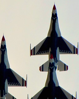
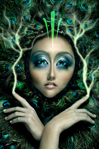
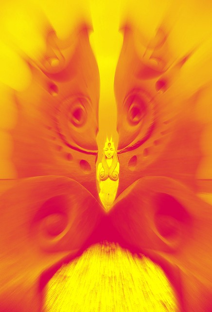
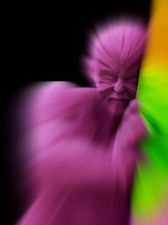
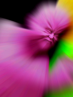
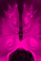
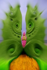
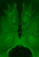
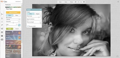
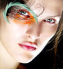
There is a brand new photo editing service on line right now. It is PicMonkey, which is developed from the people that created Picnik…the very same wonderful people. The following images were all edited using PicMonkey, and primarily in the Tint Effect function, as pictured in the screen cap below…. Note the use of the spectrum, as well as the ability to change and alter the blending modes. That is very important too, as those work on a level of light. That is the color blends in using light sources. With some experimenting and brush work of the various tint effects, you will be able to create some remarkable images. Here are some variations of a couple of photos from the annual Sand Sculpting Festival at Revere Beach….. …Remember too, this is a brand new interface in PicMonkey, and they are promising all kinds of new wonderful things. It is going to be really spectacular too, you can tell from all their enthusiasm. Each photo in this blog has an original image to compare, as well as detailed explanations of the effects used. They can easily be found through the pool at the PicMonkey group at flickr…. http://www.flickr.com/groups/PicMonkey/pool/tags/TintEffect/
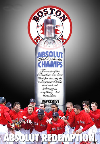
One of the most parodied advertising campaigns is the Absolut Vodka long standing play on words. It was actually the thought of Geoff Hayes of TBWA advertising agency, and it came to him while he was taking a shower one morning in 1981. The initial ad for the campaign was Absolut Perfection, with the company's name used in place of the proper spelling. They still run today and are usually of a typical style of product photography. It's all about the bottle and incorporating it in different situations that help emphasize the particular headline that the ad will carry. They are beautifully lit, with the bottle having nice highlights to show its distinctive form. In my parody below I used some transparency of the bottle to add depth to the image. It makes your eye believe the bottle is in front of the logo, because you visually see the logo through the bottle. Mine was all assembled in pieces and not shot at one time. Oh, and it was done the night the Red Sox won the World Series in 2004. Here is how I put it together...
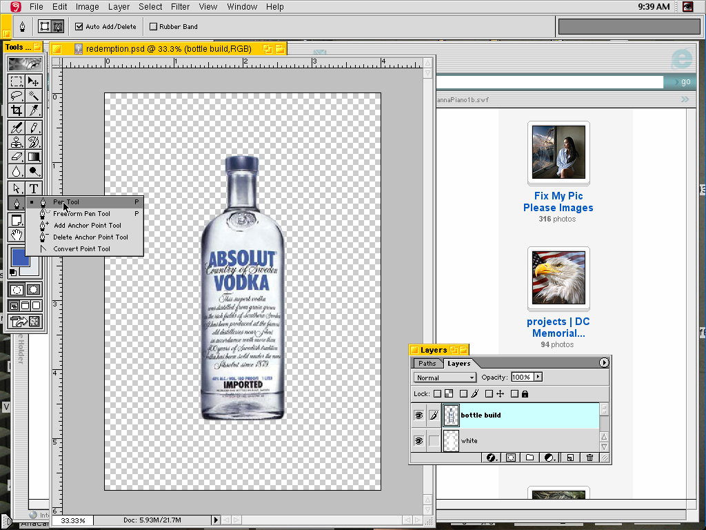
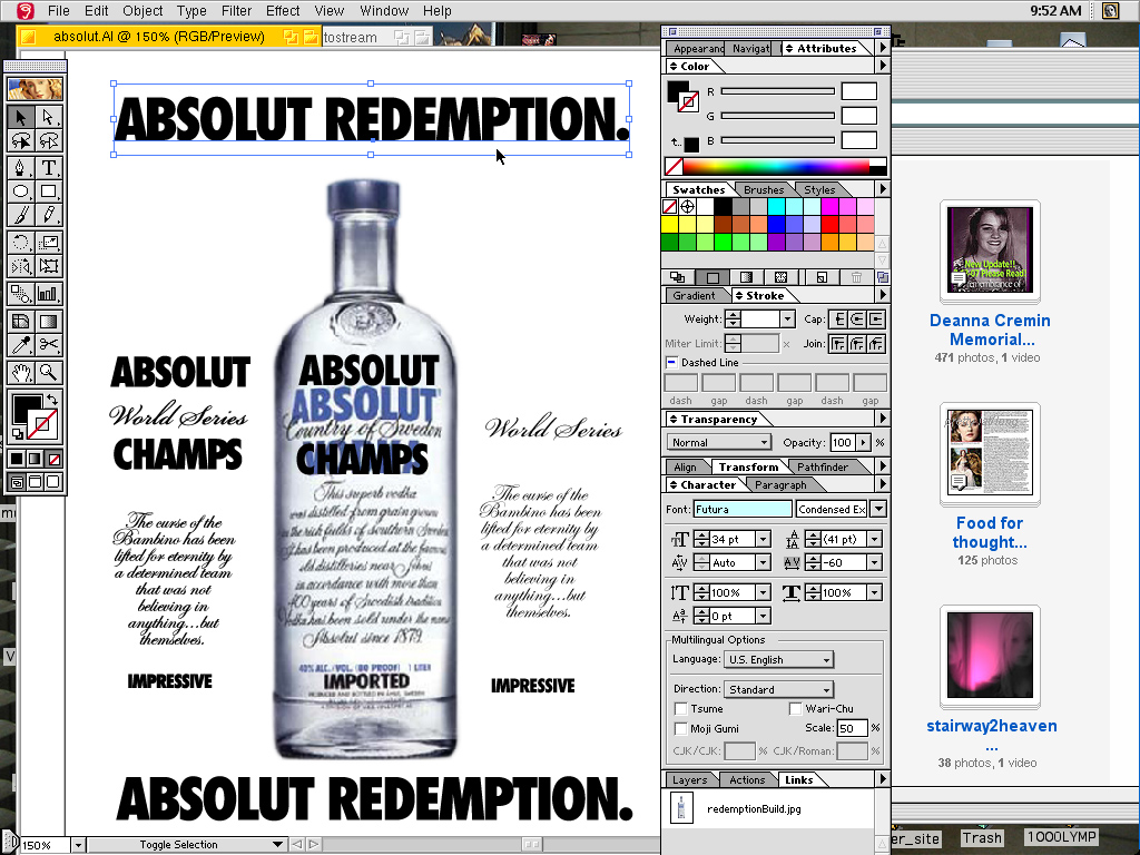
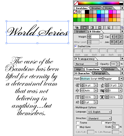
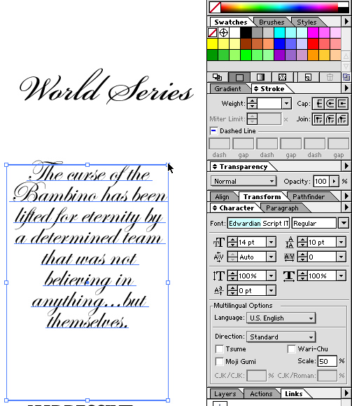
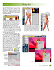
I started with a shot of the bottle, and used the Pen Tool to select… I typically use Illustrator for most of my creative work involving type. So, I brought in the photo and started matching the type. Illustrator allows you to create paths from the type as well, so I have one copy as type, and the other as paths. Once the type is pathed you can not edit it with the text tool. That is why there are two versions of the text. I always do that in case there is a chage..The headline, which usually appears towards the bottom, is Futura Extra-Bold Condensed, with a tight tracking.... I used two seperate script typefaces for the bottle too. Binkham Script for "World Series" type that was replicating the Country of Sweden from the bottle... ...and Edwardian Script for the longer text of the bottle. When the bottle is shot straight on, there is little or no distortion in the type as it wraps around the bottle. Sometimes just condensing the type on the outside portions helps for realism. The type can be done in Photoshop too...
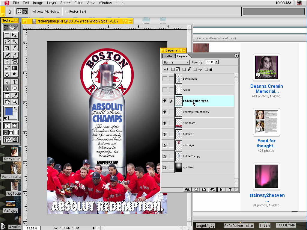
I brought the type into Photoshop on seperate layers, and airbrushed the bottle to eliminate the type that was there. I created the Red Sox logo a few years before in Illustrator for another project I was working on then. So, I brought that into Photoshop as wel....
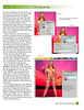
Having the bottle on top and adjusted opacity allows for the logo to show through like glass. Two layers of the neck portion will make that appear thicker because pf the opacity difference. I can easily change the type colors and such too. Use command+click on a layer to select the imagery on that layer.... I made the gradation in photoshop as well. Finding the center line by pulling out a guideline...it nudges a touch when you pass center, and will stick there. I also brought a guide down from the top ruler. I knew I only wanted the top portion to have the gradation, so that is what I selected. I used a white to black Radial gradation and went from the center point of the guides to a little outside the trim...
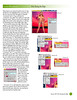
The Players are isolated, and only a portion of Garciapara (you have to have been around the Sox in 2004). I placed the bottle purposely between two players where they were split apart so the edge came done further. I replaced the word Imported with Impressive as well...matching the font which makes it look more like the original bottle. _____________________________
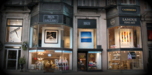
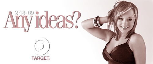
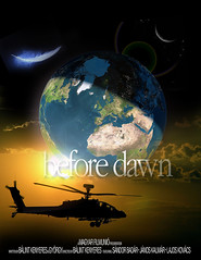
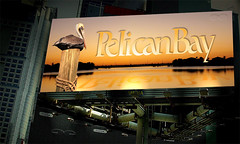
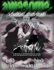
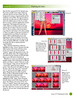
We will soon be doing a tutorial on billboard design which will feature work in Photoshop as well as bit in Illustrator. You will be okay if all you have is Photoshop though or any editing program that allows for some customization of the characters, such as kerning. One thing I like to do when I get a new project is study it a little and learn what it is all about. Here are some visual examples of some I have done over the years (can you Guess my favorite?)
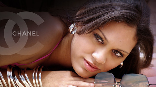
That last image is sort of started by adding in the logo. The Image is at a decent aspect ratio to begin with. That is always something to be certain of with billboards, as the come in many different shapes and sizes. But, for what we want, that will work fine and there will be more on the aspect ratio stuff in the tutorial later on. Here is another example of an image in decent aspect ratio...and the final edit it was cropped from...
Remember too, that billboards and posters come in different shapes, which are their aspect ratios...
And you can refer back to Lesson 1 for the basics in layering...
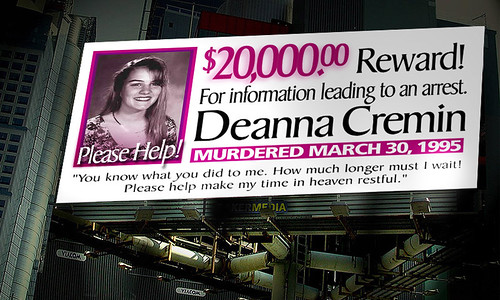
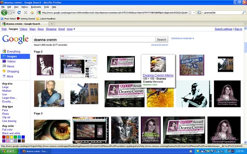
__________________________________________ Justice for Deanna Cremin the UnSolved Murder of Deanna Cremin... aired on Fox25 News by, Investigator/Reporter Bob Ward... Saturday, November 11, 2006 (5PM; 6PM; 10PM; 11PM) - Thank You!!
Media Links | Unsolved murder of Deanna Cremin, Somerville MA
| Articles on Deanna Cremin... Somerville, MA
| Unsolved: Justice For Deanna Cremin.
Fox25 News' Bob Ward, gives detailed accounts of what took place the night of March 29, 1995. Advances in forensic detective work has allowed for more evidence to surface.
"We are hopeful with the advances in forensic evidence... We also need some witness information on this case.."
Martha Coakley, Middlesex County District Attorney
![PicMonkey | Tint Effect [feat. Advanced Blending]](http://farm7.staticflickr.com/6213/7024145159_06a49a36d6.jpg)
![siloYellow1 [dithered]](http://farm8.staticflickr.com/7266/6890278312_2b9773da43_t.jpg "siloYellow1 [dithered] by gwennie2006, on Flickr")
![WomanTroyFire[ball]1](http://farm6.staticflickr.com/5345/6923680012_db79ebc2c9_t.jpg)

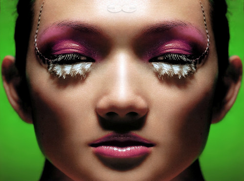
![billboard design [222 MILLION images!] page 5](https://farm8.staticflickr.com/7071/7032578601_be52977c8e.jpg)
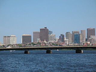
![Boston [T] party](https://live.staticflickr.com/7230/7188843444_2431e50911_w.jpg)

 | Articles on Deanna Cremin... Somerville, MA








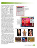


![billboard design [222 MILLION images!] page 5](https://live.staticflickr.com/7071/7032578601_be52977c8e_w.jpg)
![Screen shot 2012-03-31 [stats] Please Help](https://live.staticflickr.com/7184/6886482810_ec04835295_w.jpg)



![reflectionBC [circa 2004]](https://live.staticflickr.com/43/99634407_686392fef7_m.jpg)
![GrfxDziner group [11-30-2014, Thanksgiving weekend]](https://c2.staticflickr.com/8/7485/15915281425_dfac59fa28_m.jpg)